Logo and Stationery

Client: Addison Ridge

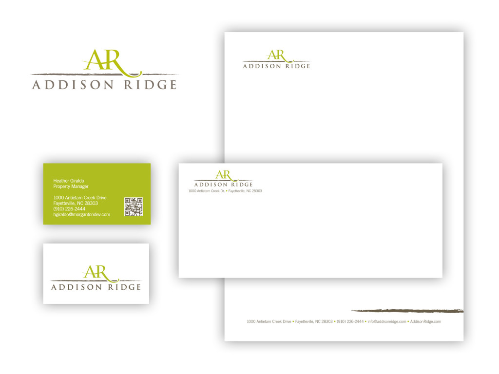
With Addison Ridge, our client, Morganton Management & Development, was introducing the Fayetteville area to an extraordinary new concept in apartment living. We designed the Addison Ridge logo to reflect the “rustic-chic” appeal of this unique development. The logo also adds an artistic touch wherever it is used, from business cards and stationery, to ads and collateral materials. (See PRINT)

Business Card

Client: Billy Richardson for Senate

Charged with developing the “front-line” image for this candidate for office, we wanted to be sure his logo was bold, yet friendly (reflecting his commitment to put people over politics), and readily recognizable … something that would be an inviting gateway to his message and remembered by people at the poll.

Logo and Stationery

Client: Valley Regional Imaging

When a prominent group of radiologists formed a partnership with the area’s major health care system to operate an independent radiology center, they wanted their new, joint image to be recognized and remembered for both the name and the acronym VRI. Our logo and tagline also convey the high-tech nature of their “business” with a graphic icon reminiscent of state-of-the-art imaging equipment.

Logo and Stationery

Client: Kuhn Dental Associates

No “ordinary dentist,” Kuhn Dental offers many state-of-the-art procedures.  Their dentists have advanced training in specialty areas including dental implants, cosmetic and restorative dentistry and dental sedation. When they wanted to update their logo, we delivered – with strong type, and an icon that smiles brightly and makes the logo stand out. A whimsical touch shows that Kuhn Dental is patient-friendly.

Logo and Stationery package

Client: Cross Creek Dental

Cross Creek Dental is proud of its longstanding reputation as a gentle, friendly dental practice, providing care that ranges from pediatric services to adult treatment. When they wanted a logo and corporate materials that reflected this image of quality care for patients of all ages, Hodges delivered – with a design that helps their practice stand out. In addition to designing the logo, we also produced stationery and business cards.

Logo and Stationery Design

Client: Fayetteville Symphony Orchestra

Since its founding in 1956 as a volunteer community orchestra, the “FSO” has grown to become the highly professional symphony that prompted a reviewer in Classical Voice of North Carolina to comment, “… we were amazed to the point of being almost speechless.” When the Symphony asked Hodges to create a new logo, we wanted to be sure it reflected the excellent reputation they currently enjoy. Our logo design conveys a lyrical quality, combining modern graphics with classical appeal. The tagline – Cape Fear’s own – reflects pride in the fact that this first-rate orchestra belongs to this region. The distinctive two-sided stationery we designed conveys the artistic nature of this organization.